Building a Color Story Across a Collection (2026)
A color story is more than a palette. Here is how to build one across a whole collection, keep it consistent from sketch to PDP, and ship it without rework.
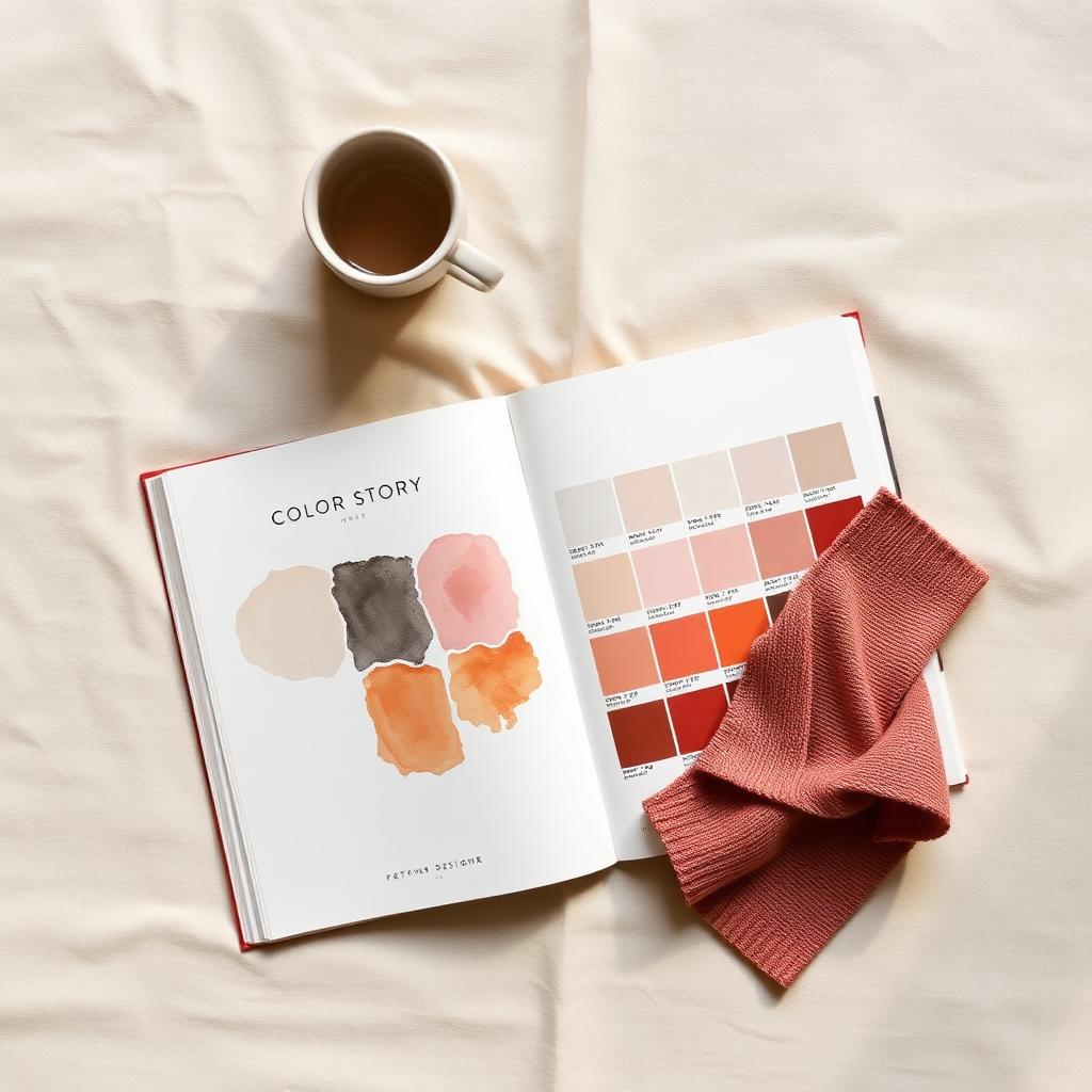
What is a color story?
A color story is the planned set of colors for a collection and the rules for how those colors get used across styles. It defines which colors are core, which are seasonal accents, which are neutrals, and how they repeat from one product to the next.
A palette is the raw set of swatches. A color story is the palette plus a plan. It answers the questions a palette cannot: which color leads, which color supports, how many styles carry each color, and how the colors connect a jacket to a tee to a bag so the line reads as one collection.

The fashion industry runs on shared color language. The Pantone Color Institute publishes a Fashion Color Trend Report each season that names the top colors designers are showing, and its Color of the Year program sets a reference point the whole industry talks in. You do not have to follow either one. But your color story should be written in the same precise language they use, with real codes, not "that nice green."
Color story vs colorway vs palette: the difference
These three terms get used as if they mean the same thing. They do not, and mixing them up is where a lot of confusion starts.
| Term | What it is | Scope |
|---|---|---|
| Palette | The set of colors you are working with | The raw swatches |
| Colorway | One specific color version of one style | A single product |
| Color story | The plan for how colors are used across the whole collection | The full line |
A palette is your box of crayons. A colorway is one drawing in one set of colors, for example "the field jacket in olive" versus "the field jacket in black." A color story is the rule that says the field jacket comes in olive and black, the tee picks up the same olive, and the whole spring drop leans warm with one cold accent.
If you want the deeper version of how a single style gets multiple color versions, read our guide on the AI colorway generator. This post is the level above that: the story that ties all the colorways together.
Why most color stories fall apart in production
A color story usually looks great as a board. It falls apart somewhere between the board and the shipment. There are three common reasons.
First, the colors live in too many places. The designer has one set of swatches. The factory has a slightly different dye lot. The PDP gets a third version because the photographer lit it differently. Nothing carries forward, so color drifts at every handoff.
Second, the story is built from a feeling instead of a rule. "Warm and earthy" is a vibe, not a plan. Without a core, accent, and neutral structure, every designer on the team interprets the vibe their own way, and the line splinters.
Third, the colors never get assigned to real styles. A board with twelve beautiful colors means nothing until you know which jacket, which knit, and which dress each one lands on. Concept dies on a moodboard. The brands that ship turn the story into product-ready colorways tied to specific styles.
The anatomy of a color story
A working color story has three groups. Naming them and setting a ratio between them is what turns a palette into a plan.
Core colors
Core colors carry the season. These are the two to four colors most of your styles will use, the ones a customer would name if you asked what the drop "looks like." Core colors should connect back to your brand, not just to a trend report.
For a brand known for muted, outdoorsy basics, a core might be olive, washed navy, and bone. Those colors will appear on the most styles and the highest unit counts.
Seasonal accents
Accents are the colors that make a season feel new without rebuilding the brand. You use them on fewer styles and in lower volumes. They are the pop in the lookbook and the reason a loyal customer buys again instead of feeling like they already own the drop.
This is where a trend input like the Pantone Fashion Color Trend Report earns its place. Use it for one or two accents, not for your whole story.
Carryover and brand neutrals
Neutrals are your black, your white, your gray, your signature off-white. They carry over season to season and quietly do most of the selling. A strong color story leans on neutrals as the backbone so the core and accent colors have something to sit against.
Carryover here also means proven sellers. If a color sold through last season, it can earn a spot again. Refreshing a proven color on a proven style is often higher return than inventing a new one, which is the logic behind the refresh a carryover product workflow.
How to build a color story across a collection, step by step
You do not need a forecasting subscription to build a strong color story. You need a structure and the discipline to assign every color to a real style. Here is a sequence that works.
1. Start from brand DNA, not a mood
Write down what your brand already owns in color. Your best sellers. Your neutrals. The two or three colors a customer associates with you. That is your starting constraint, and it is a good one. A color story that ignores your brand reads as a generic season anyone could have made. This is the collection concept from brand DNA job.
2. Set a core, accent, and neutral split
Decide the ratio before you fall in love with any single color. A common split for a small collection is two to three neutrals, two to three core colors, and one to two seasonal accents. Write the ratio down. It will stop you from adding a fourth accent you cannot afford to sample.
3. Assign colors to styles, not just to swatches
This is the step most teams skip. Take every color and assign it to specific styles. The olive goes on the field jacket and the tee. The accent rust goes on one knit only. If a color does not have a home on a real product, it is not in the story yet. It is just a swatch.
4. Map the color story to the line plan
Now connect color to units. Lay the color story over your fashion line plan so you can see how many SKUs each color creates and what that does to your buy. A story that looks balanced on a board can be wildly unbalanced in units once you multiply colors by sizes. Catch that here, before sampling, by reviewing the line plan.
5. Lock color references before sampling
Convert every color in the story to a real reference, a Pantone TCX code or a physical standard, before anything goes to a factory. Ambiguous color is the single biggest source of sampling rework. A locked reference is what lets the jacket, the knit, and the PDP all land on the same olive.
How many colors should a collection have?
There is no magic number, but there is a useful range. For a small drop, three to six colors total across core, accent, and neutral is usually enough to feel intentional without ballooning your SKU count. A full seasonal collection might run eight to twelve.
The real limit is not taste. It is units. Every color multiplies across your size run, so each new color is not one new SKU, it is one new SKU per size per style it touches. That is why the color count belongs in the same conversation as assortment planning, not in a separate creative bubble.
A simple test: if you cannot name the job each color does in the line, you have too many. Cut until every color has a clear role.
Color story vs trend chasing
A trend report tells you what is in the air. It does not tell you what belongs on your brand. The difference matters.
| Trend-led | Story-led | |
|---|---|---|
| Starting point | This season's hot colors | Your brand DNA and best sellers |
| Risk | The drop looks like everyone else's | The drop looks like you |
| Use of trend | The whole palette | One or two accents |
| Repeat customer | "I already own this" | "This is the brand I love, in a new color" |
| Markdown risk | Higher, colors do not connect | Lower, the line reads as one collection |
The point is not to ignore trends. It is to use them as seasoning, not as the meal. Pull one or two accents from a report like Pantone's, then build the rest of the story from what your brand already owns. Trend chasing produces a season. A story produces a brand.
Keeping color consistent from sketch to PDP
The hardest part of a color story is not picking the colors. It is keeping them identical from the first sketch to the live product page. Color drifts at every handoff unless you control it.
Three places color usually breaks, and the fix for each:
- Sketch to sample. The designer's swatch and the factory's dye lot do not match. Fix: lock a Pantone TCX or physical standard before sampling, never a screenshot.
- Sample to imagery. Lighting and camera profiles shift the color in photography. Fix: shoot or render against a known reference and check against the standard, not against the screen.
- Imagery to feed. The color you call "rust" on the PDP is submitted as "orange" in the feed, or with the wrong format. Fix: follow the marketplace color rules.
That last one is more technical than most teams expect. The Google Merchant Center color attribute requires a single primary color per variant and rejects formats like comma-separated lists or hex codes. Google's own best practices for apparel and the full product data specification spell out exactly how color has to be submitted. Your color story does not end at the lookbook. It has to survive all the way into structured feed data, which is the job of the optimize fashion products for marketplaces workflow.

Common color story mistakes and how to fix them
Building the story without the line plan
A board with twelve colors can quadruple your SKU count once you multiply by styles and sizes. Build the color story and the line plan together, not in separate rooms.
Too many accents
One or two accents make a season feel new. Five accents make a collection feel random and blow up your buy. Keep the accent group small and let neutrals do the heavy lifting.
Naming colors instead of coding them
"Sage" means a different thing to your designer, your factory, and your photographer. Assign a real Pantone or physical reference to every color so there is one truth, not three opinions.
Letting each style pick its own version of a color
If the jacket olive and the tee olive are slightly different, the line stops reading as one collection. Use the same locked reference across every style that carries a color.
Stopping the story at the lookbook
Color has to make it into the PDP and the feed, formatted to spec. If you do not plan for that, your beautiful story disapproves in Google Shopping and never reaches the customer.
How a color story affects sell-through
Here is the part most color articles skip. A color story is not a creative exercise. It is a merchandising decision that shows up in your sell-through.
When the story is tight, the line reads as one collection, which makes cross-selling easy. The customer who buys the olive jacket sees the olive tee and the bone bag and builds an outfit. Neutrals carry the volume. Accents drive the new-season feeling that brings repeat customers back. The result is fewer orphan SKUs and fewer end-of-season markdowns.
When the story is loose, you get color orphans. A style in a color nothing else picks up. A buy that skews toward an accent that sold in low units. Those are the SKUs that sit on the rack and get marked down, and they are almost always a color planning problem, not a product problem.
So the real question is not "do these colors look nice together." It is "does every color in this line have a job, a home style, and a place in the buy." That is a planning question, and it is the one Kampana is built to answer.
How Kampana builds a color story
Kampana is an AI product creation OS for fashion brands. It builds a color story as connected steps on a node-based canvas. You start from your brand DNA, generate core, accent, and neutral groups, explore colorways on real styles, and carry the same locked color all the way to PDP imagery and feed data. Every product-accurate asset passes an approval gate and a product-fidelity check.

What you get
- A structured color story from your brand DNA: core, accent, and neutral groups with real color references
- Colorways generated on your actual styles, not on generic swatches
- A view of how each color maps to your line plan and SKU count
- Product-accurate PDP renders that hold the same color from sketch to page
- Feed-ready color attributes that match marketplace rules
The old way vs Kampana
| The old way | With Kampana | |
|---|---|---|
| Where color lives | Board, spreadsheet, photos, feed | One canvas, one source of truth |
| Color reference | A screenshot or a name | A locked reference carried through every node |
| Colorways | Drawn one style at a time | Generated on real styles from the story |
| PDP and feed | Rebuilt later, color drifts | Generated from the approved product |
| Approval | Ad hoc | Approval gate + product-fidelity check on every asset |
How it works
- Drop your brand DNA and best sellers on the canvas.
- Generate the color story: core, accent, and neutral groups with real references.
- Apply colorways to specific styles and check them against the line plan.
- Approve each product-accurate colorway and carry it to PDP and feed.
Pricing is credit-based. One shared pool for the whole workspace, unlimited users, no per-seat fees, and credits do not expire. As a rough guide, the collection concept workflow that produces the color story runs 2,000 to 6,000 credits depending on how many styles and colorways you generate. You spend on what you actually create. See pricing for current credit packs.
Frequently asked questions
What is a color story in fashion?
A color story is the planned set of colors for a collection plus the rules for how those colors are used across styles. It defines core colors, seasonal accents, and brand neutrals, and how each repeats from one product to the next so the line reads as one collection.
What is the difference between a color story and a colorway?
A colorway is one color version of a single style, like a jacket in olive. A color story is the plan for how colors are used across the whole collection. One color story contains many colorways and sets the rules that connect them.
How many colors should be in a color story?
For a small drop, three to six colors across core, accent, and neutral is usually enough. A full seasonal collection might run eight to twelve. The real constraint is your SKU count, since every color multiplies across styles and sizes, so each color should have a clear job before it makes the cut.
Should I build my color story around Pantone Color of the Year?
You can reference it, but you should not build the whole story around it. Use a trend input like the Pantone Color of the Year or Fashion Color Trend Report for one or two accents, and build the rest of the story from your brand DNA and best sellers so the drop looks like you.
How do I keep color consistent from design to the product page?
Lock a real color reference, like a Pantone TCX code or a physical standard, before sampling. Use that same reference across every style, check imagery against the standard rather than the screen, and submit color to feeds in the required format. Color drifts at every handoff unless one reference carries through.
How does a color story affect a product feed?
Marketplaces have strict color rules. The Google Merchant Center color attribute requires one primary color per variant and rejects comma-separated lists and hex codes. If your color story does not translate into clean feed attributes, products can be disapproved, so the story has to carry all the way into structured data.
Can AI build a color story?
AI can draft the structure fast: core, accent, and neutral groups, colorways on real styles, and a view of how color maps to the line plan. A person still approves the final colors and signs off that each render is product-accurate. The reliable pattern is AI generates and a human approves.
The bottom line
A color story is simpler than the mood boards make it look and more important than the swatches suggest.
It is not a wall of pretty colors. It is a set of rules that decide which colors lead, which support, and which style carries each one, across a whole collection and all the way into the feed. The brands that get value from it are the ones that build the story from their own DNA, assign every color to a real product, and lock the references before color can drift.
If you want your next collection's color story to hold from brand DNA to colorways to PDP, in one place with approval gates on every asset, that is exactly what Kampana is built for. Start creating, free, or explore the fashion workflows to see each stage.
Send one product URL. Kampana turns it into a mini campaign pack.